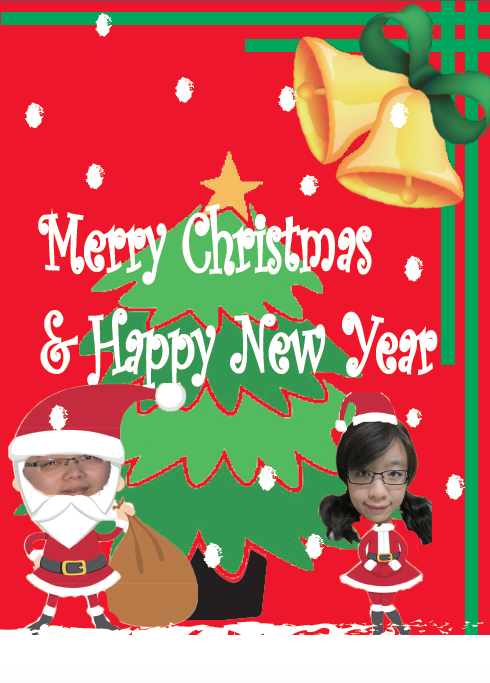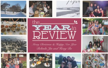
IEC-BC Holiday Social Media Posts

IEC-BC Monthly Social Media Cover/Banner

ASCEND Project Game Characters
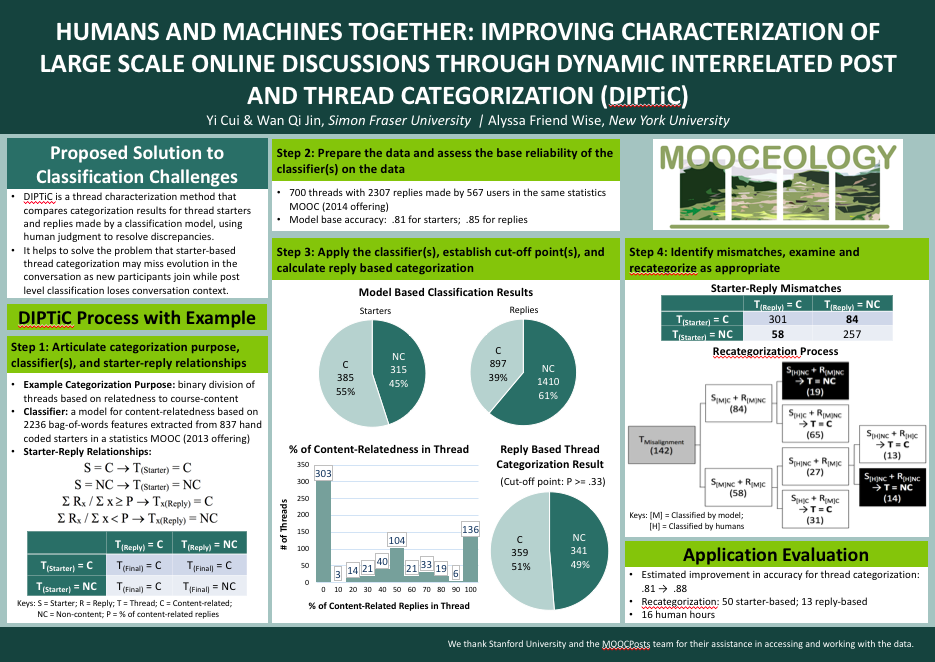
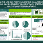
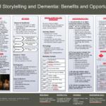
CONFERENCE POSTERS

LOG MY HOUR

LOGO & BANNER & PHOTO EDITING for LAK'17
LOGO MOOCEOLOGY

LOGO Escape Radio

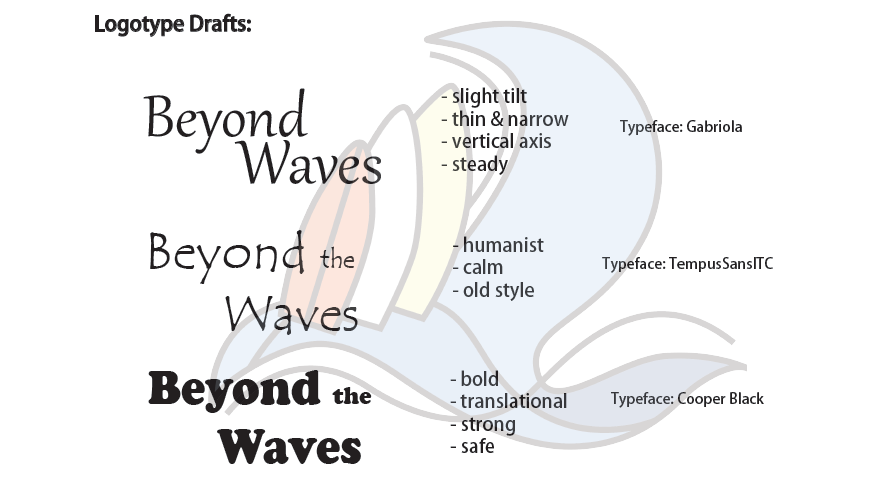
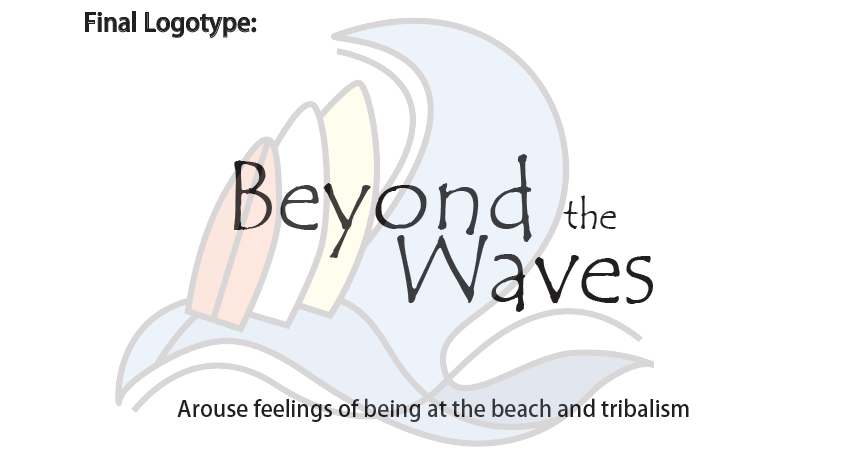
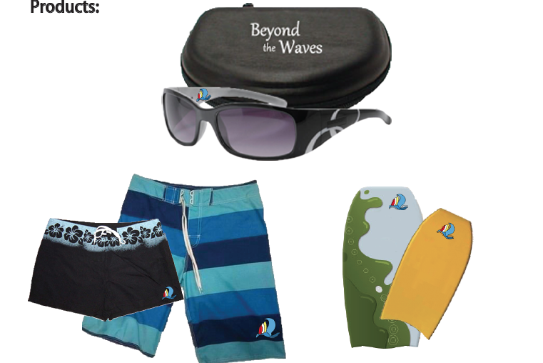
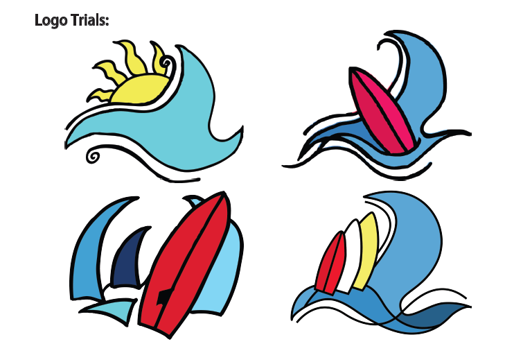
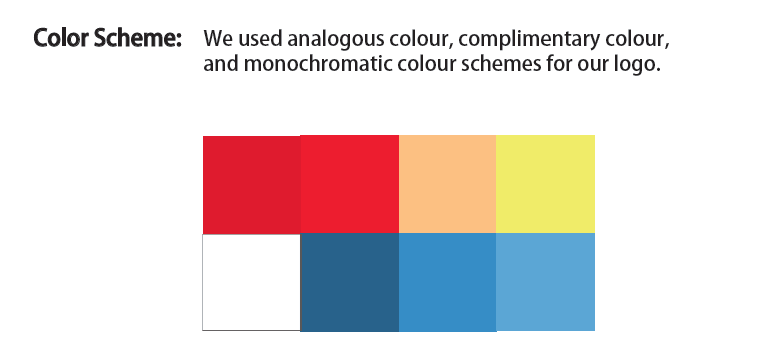
LOGO Beyond The Waves
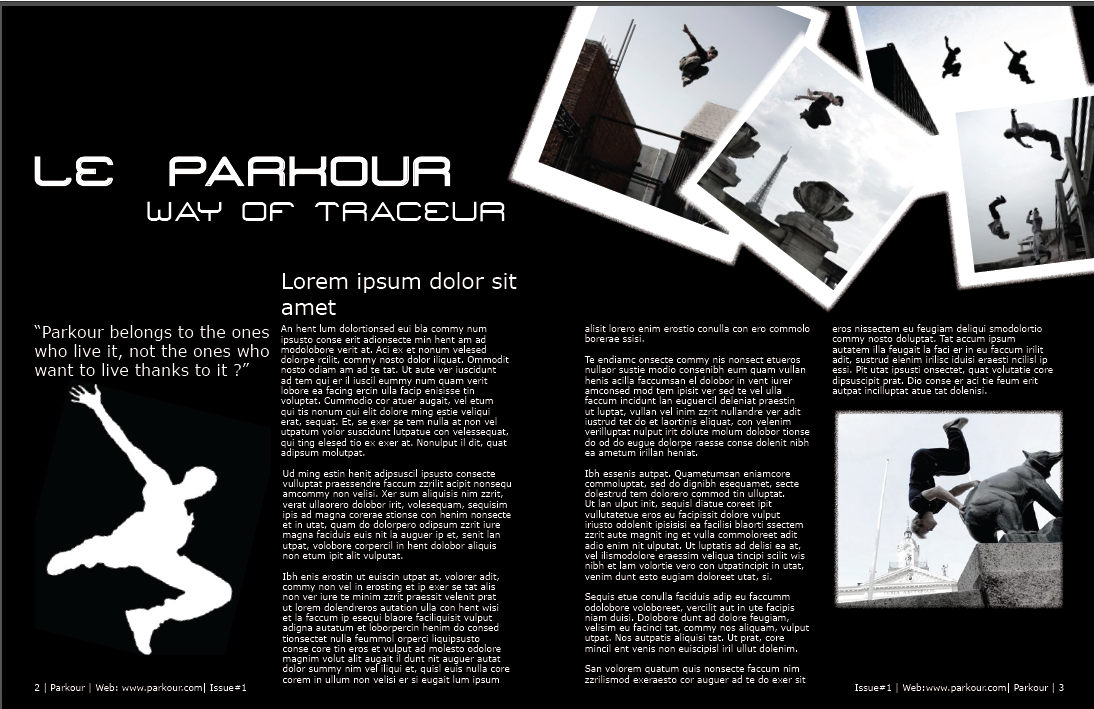
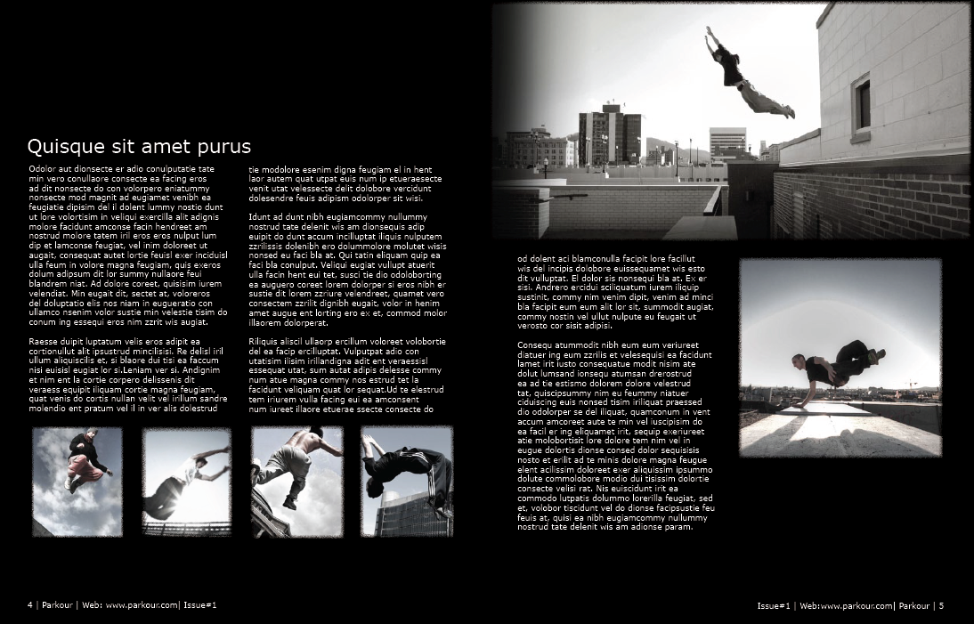
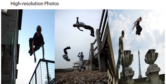
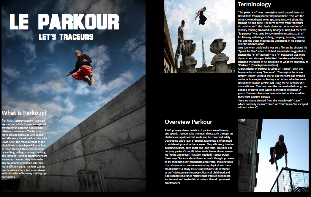
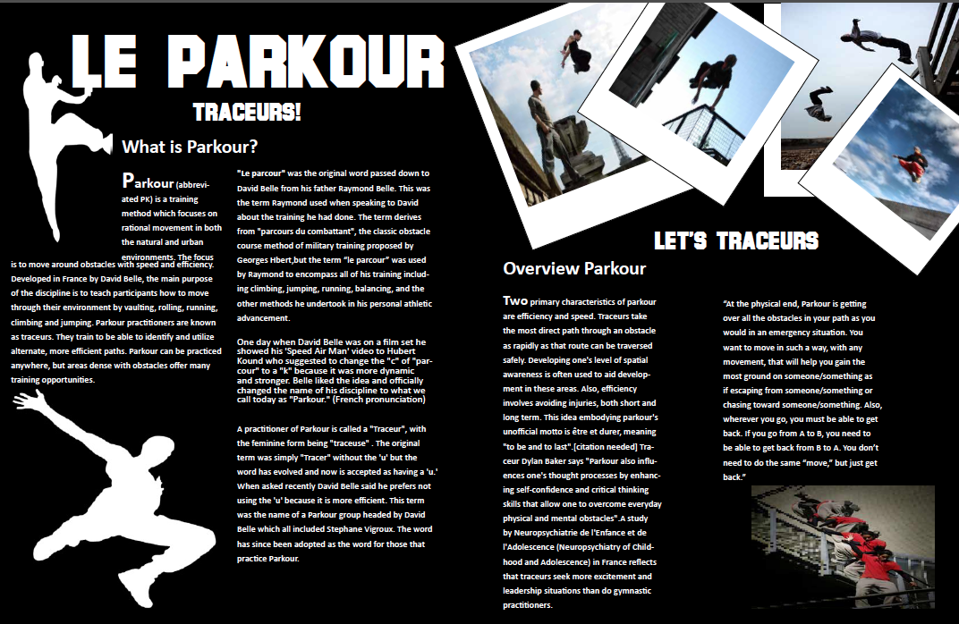
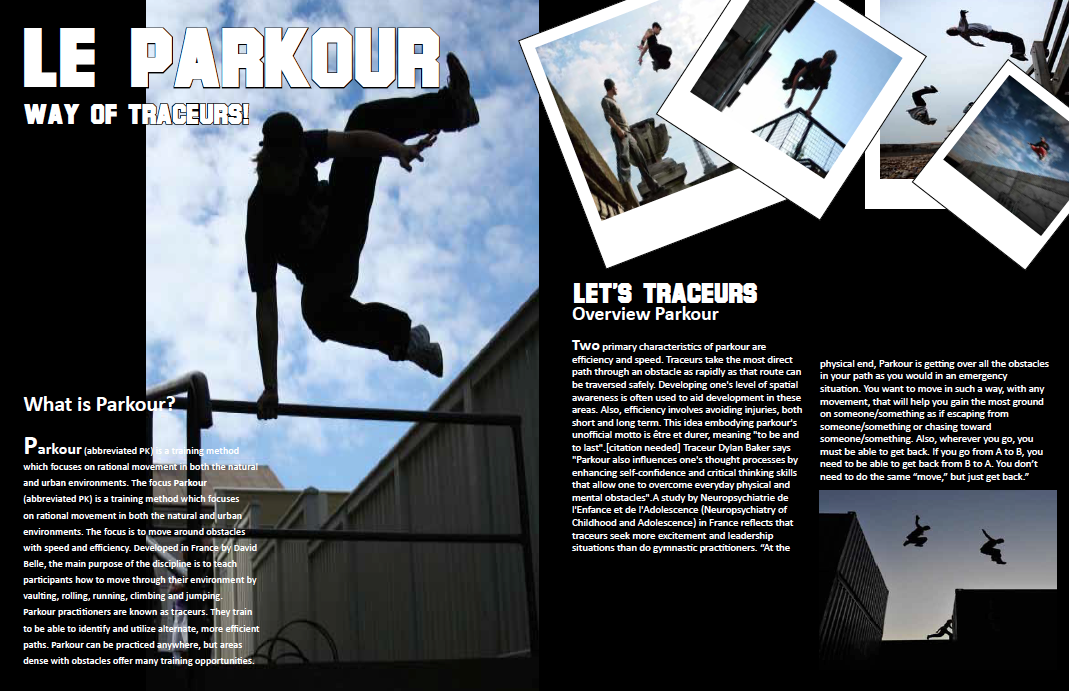
MAGAINZE LAYOUT Le Parkour

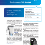
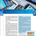
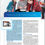
MAGAZINE Connected Living
MAGAZINE Perfect Wedding
BOOK Deceptively Delicious
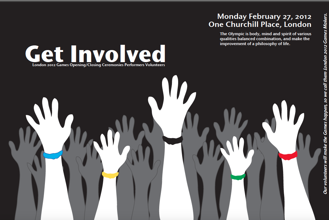
POSTER Get Involved
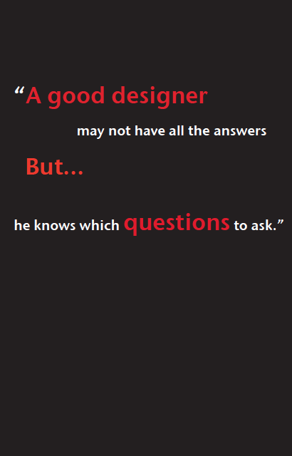
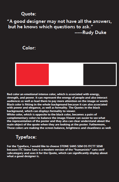
POSTER Quotes

POSTER Air Canada
POSTER Graeme & Ann Wedding
BANNER SFU Recreation
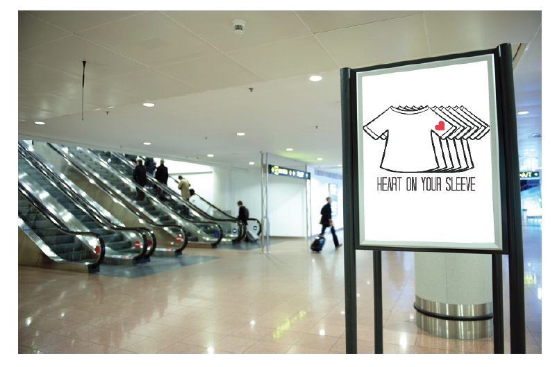
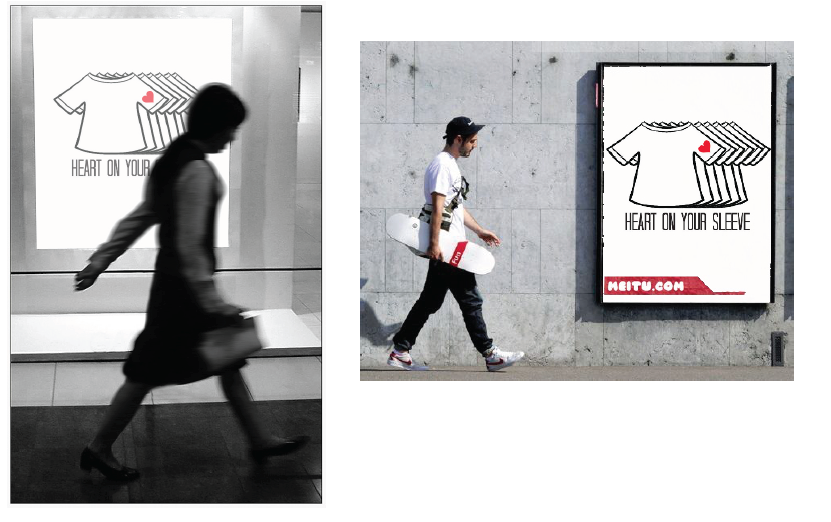
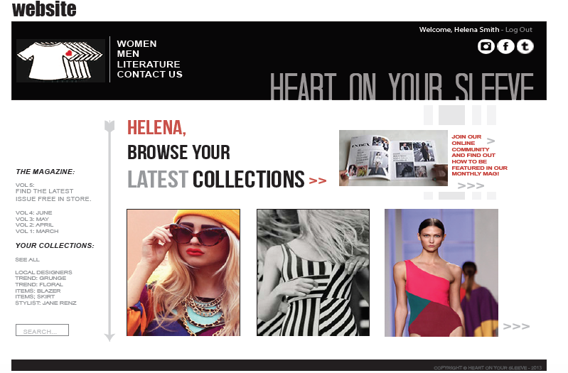
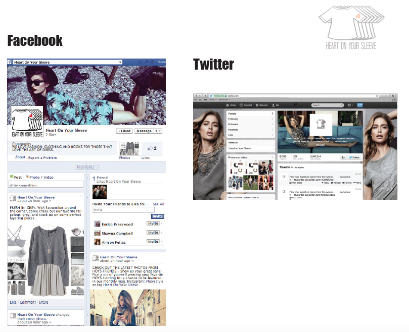
COMPANY DESIGN Heart On Your Sleeve
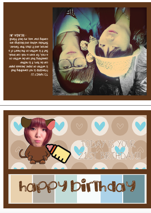
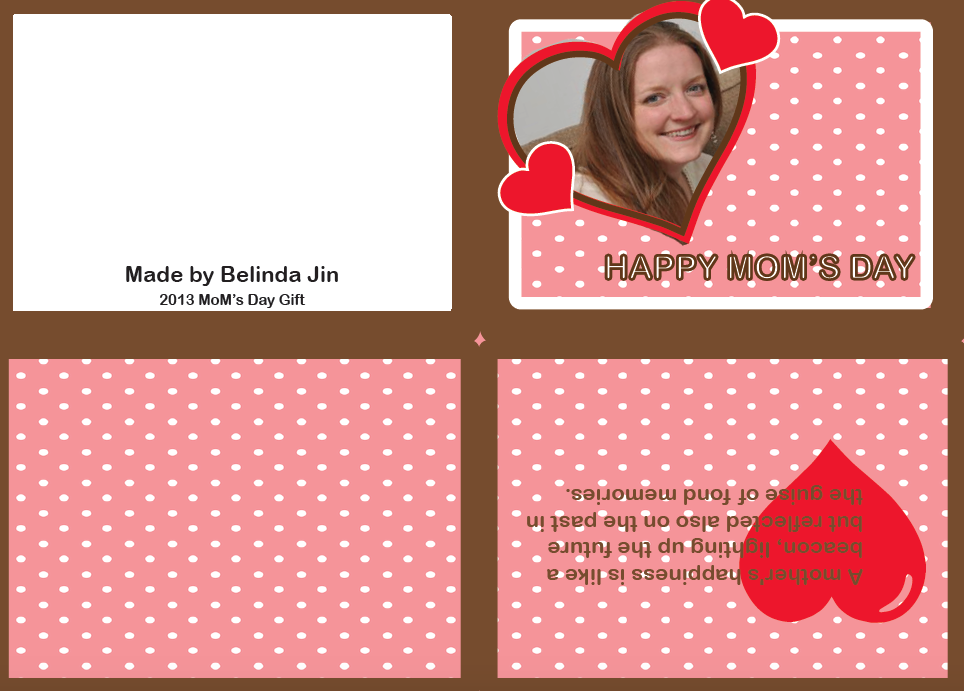
Cards
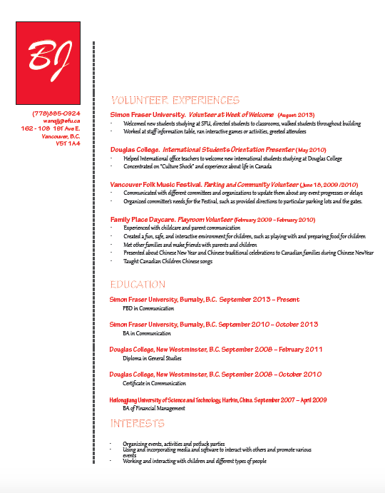
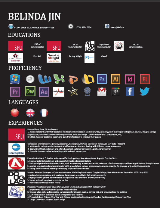
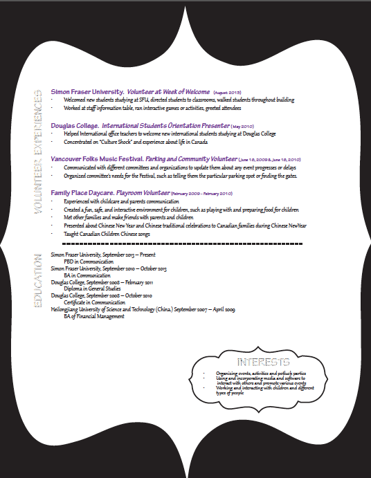
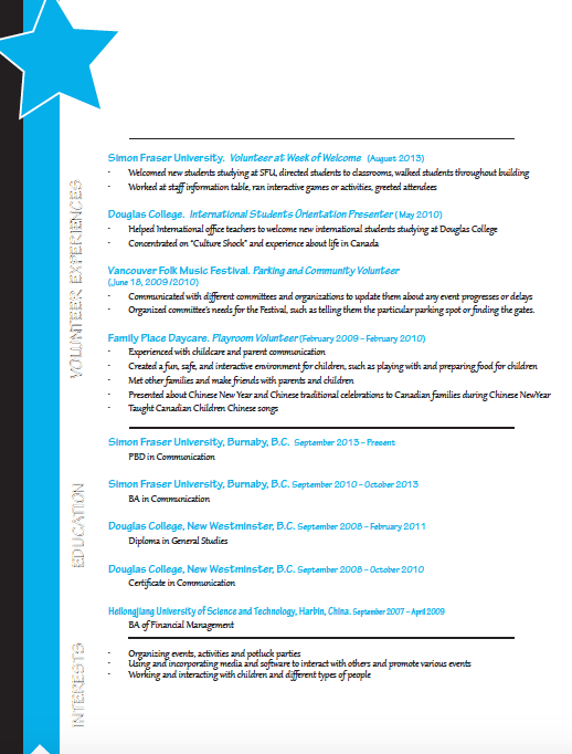
Resume Design

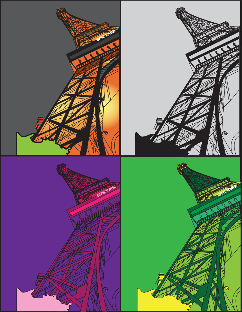
Eiffel Tower
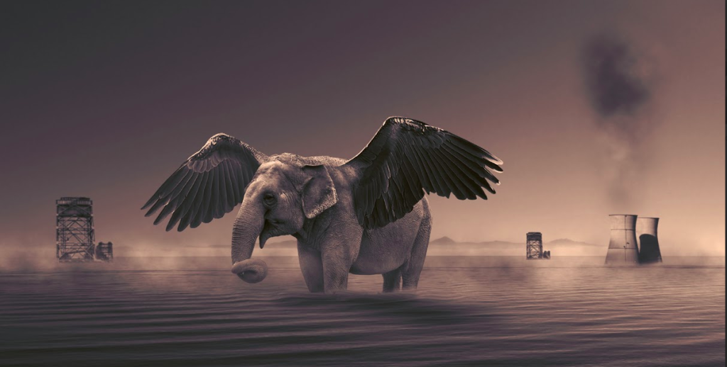
Creative Design
-

LOGO & BANNER & PHOTO EDITING for LAK'17
The 7th International Conference on Learning Analytics & Knowledge, LAK17, will be hosted in beautiful Vancouver by Simon Fraser University. The Logo represents nature of Vancouver and the follow LAK'16 design. The target audiences of the 7th International Learning Analytics and Knowledge (LAK) Conference mainly reflects the success of the growing community of researchers, practitioners, and learners in leveraging the power of "big data" to create substantial impact within higher education and learning at increasingly larger scale. The purpose of this design is deliver information about this event, holds in the city of Vancouver in 2017 through its official website. The client has provided me the past logo and handouts. For this product, I have to keep same format as the past design and play with particular colors: white, black, and blue. Based on the purpose of the design, my client and I believe that the focal point should be the city of Vancouver since it will holds the event. Also, this ad need to cover information about this event and logo of this event. In this way, I choose an image of Vancouver landscape as the background image of the advertisement for this event. Colors Used: White, Black, and Blue. ( My client has already choose those colors for me) Colors meanings: • I used white color as background color and line up the image, which makes the ad simple and clean. Also, white is associated with light, goodness, innocence, purity, and virginity. It is considered to be the color of perfection. White means safety, purity, and cleanliness. • Blue: is the color of the sky and sea, which can directly represent sky and sea of Vancouver. It is often associated with depth and stability. It also symbolizes confidence and intelligence, which can present the meaning of this event. • Black: The color black represents strength, seriousness, power, and authority. I used it in the title of the ad because it is the traditional color of mourning in many Western countries. In addition, It shows the event is very serious and important of the event. In my design, black is used for typography, because of it’s neutrality. Black can make it easier to convey a sense of sophistication and mystery in a design. -

LOGO MOOCEOLOGY
This logo was designed for my research team and used by presenter Yi Cui in LAK 16 The 6th International Learning Analytics & Knowledge Conference. The logo can represent the development of massive open online courses. -

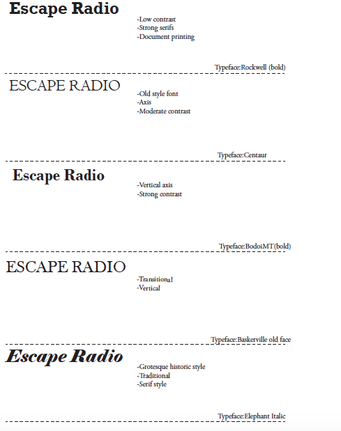
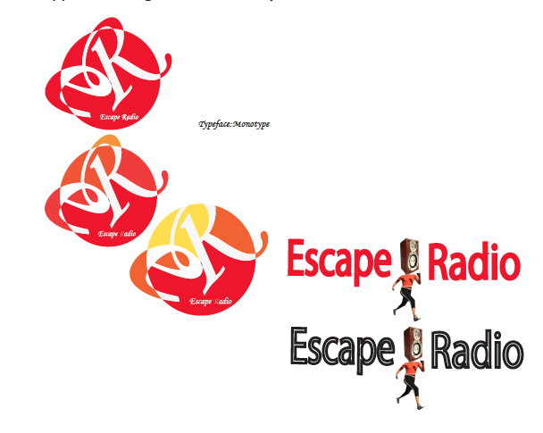
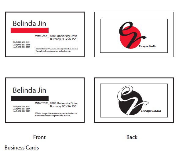
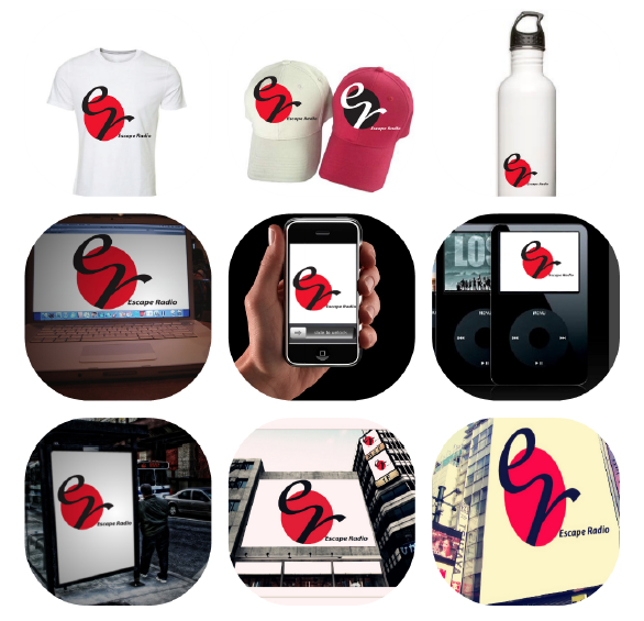
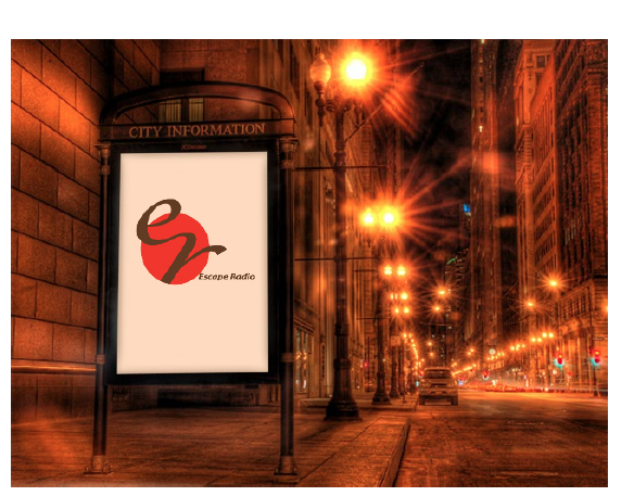
LOGO Escape Radio
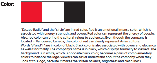
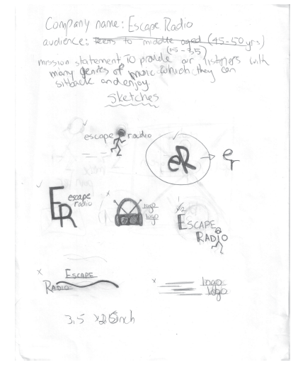
Escape Radio is an Asian broadcasting corporation in Canada. It serves lots of people, especially senior people to participate with it. Also, it has connections to Canadian multicultural society. It plays unique and high quality classical music, displays fantastic performances, contributes knowledgeable public affairs programming, and creates foreign languages training shows. Escape Radio is also a dynamic and educational resource, which provides people who live in multicultural society, can understand the real world.
-
MAGAZINE Connected Living
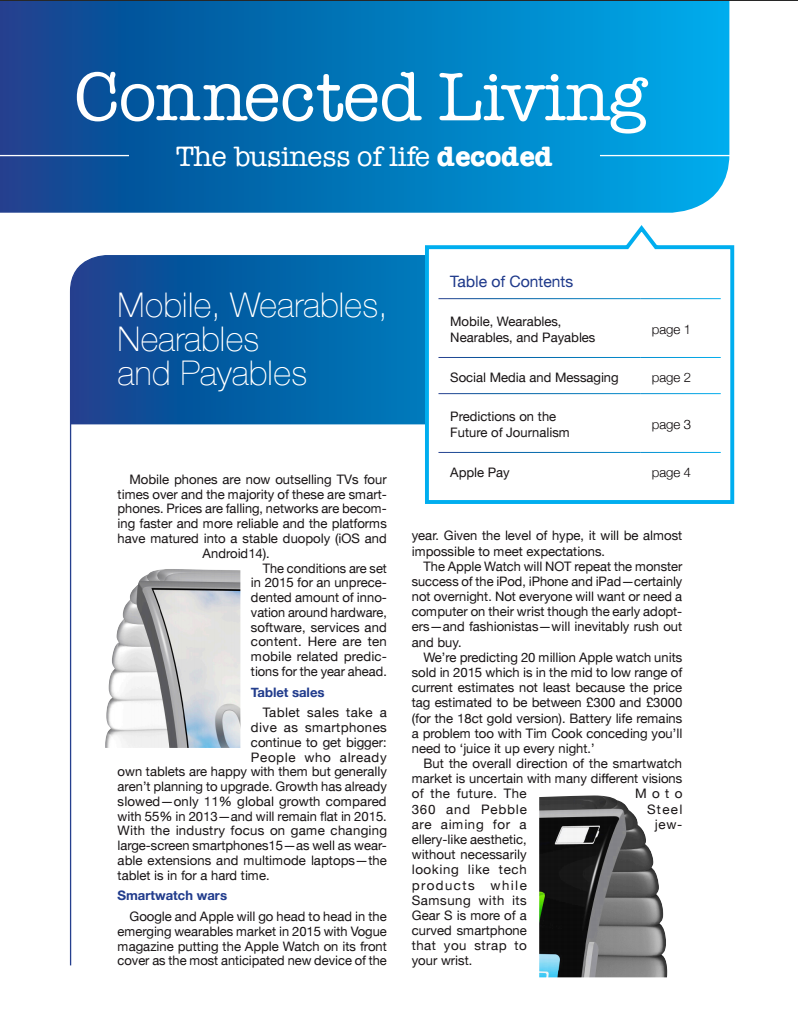
The Connected Living spread features articles on technology and communication, and thus was designed to have a sleek, minimalistic, high-tech feel. This is achieved through the use of sleek, curved shapes, blue gradients, and simple, uncluttered layouts. The theme is further carried out through the use of a thin sans serif typeface. -

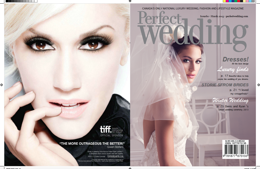
MAGAZINE Perfect Wedding
Perfect Wedding
Personnel
Responsible
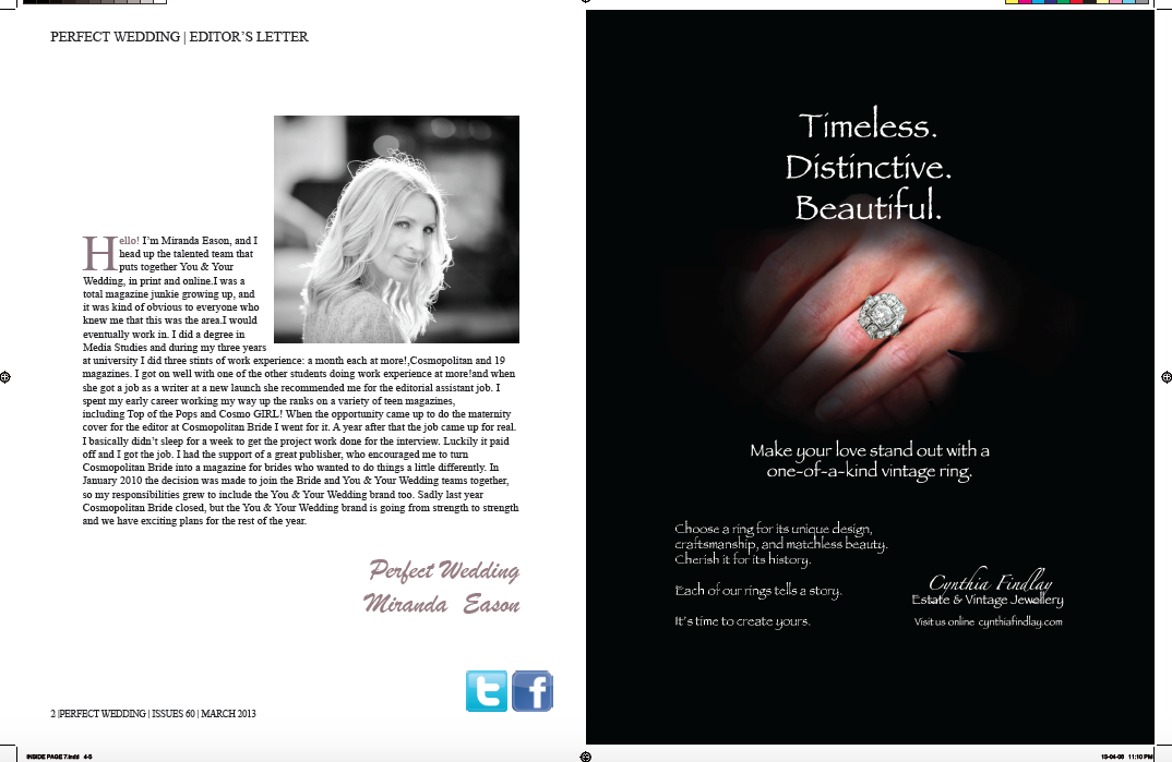
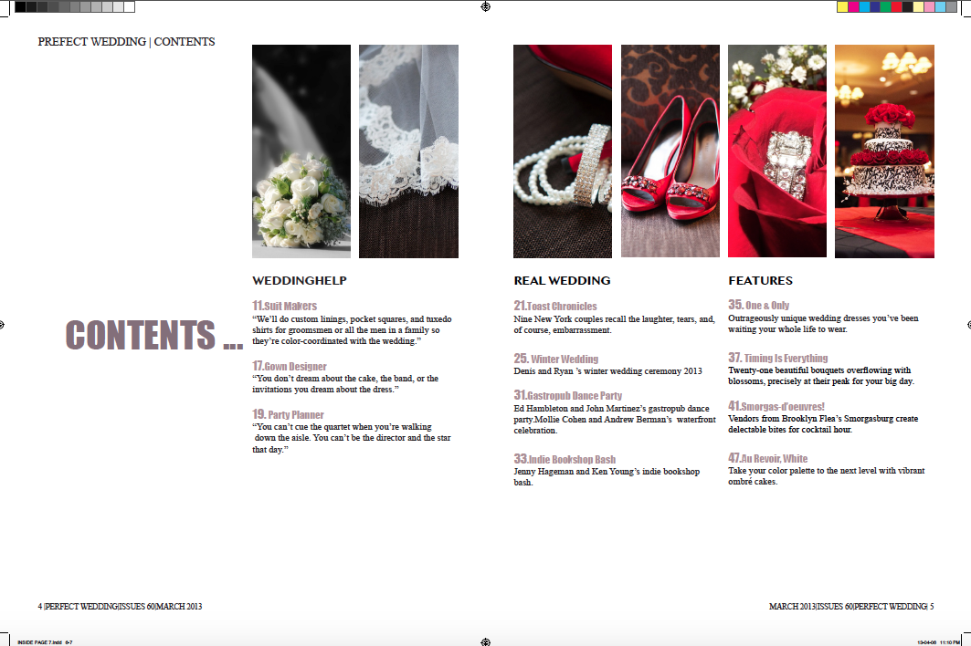
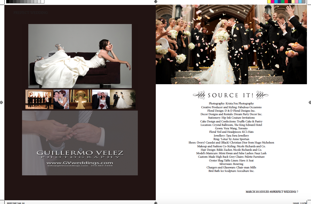
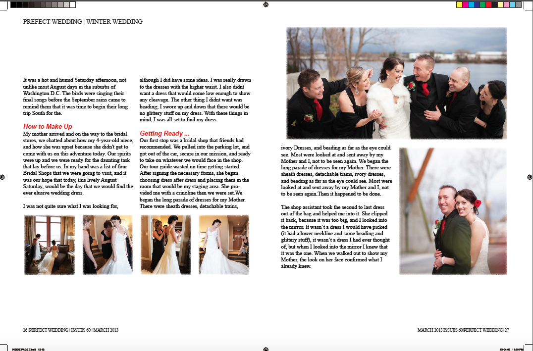
For this project, I have chosen to redesign the magazine, which is called Perfect Wedding, is Canada’s only national luxury wedding magazine since one of my Canadian family members just got married. During the process of redesign, I would like to learn about styles from the original magazine designer and create my new version magazine to approach my knowledge in the design magazines. In addition, I also will ask the feedback and suggestions from professor and TA during each of the design stages.
The concept of the project
The goal of this project is to redesign an existing English – language consumer magazine. During the process of design a magazine, I would like to learn about design elements from the process of the redesign and develop the aesthetic from original magazine; at the same time, I wish the redesigned magazine from me, which can create more new couples’ attentions and also promote its value to the both of consumers and market.
Objectives
For this project, I will create a magazine cover, including: Nameplates, Tagline, Cover lines, Date/ Volume/ Issue Number, Barcode/ISSN and price. Moreover, I will also create double page spreads, including: article title, subtitle, deck, running head, byline, callout and so on.
Audiences
In term of my magazine target audiences will be the couples who will get married soon and prepare for their wedding ceremony. Especially, this magazine is for brides because it gives lots of advices about how to pick nice wonderful dress for the brides.
Selling Proposition
The magazine is going to give consumers suggestions to prepare for their wedding ceremony. The magazine of Prefect Wedding focus on wedding planning, which not only offers the suggestion for young couples preparing their wedding, but it also gives advice to audiences to decorate wedding place, choose wedding dress and suit, as well as share the life experiences with readers. The price of the magazine, which is not expensive, is around $5 to $15 because this range is the most of people are affordable. User Value Proposition/ Benefits Within the Perfect Wedding, it introduces the process of the wedding steps by steps, including how to choose the dress, how to dress up, how to decorate the ceremony place, and how to prepare the wedding food and drink. It even shares the personal experiences about where is the best place to take honeymoons and creates the gallery to show the read wedding. Therefore, this is awesome magazine because it offers a good choice for new couples and helps them to prepare a great wedding in their life.
-

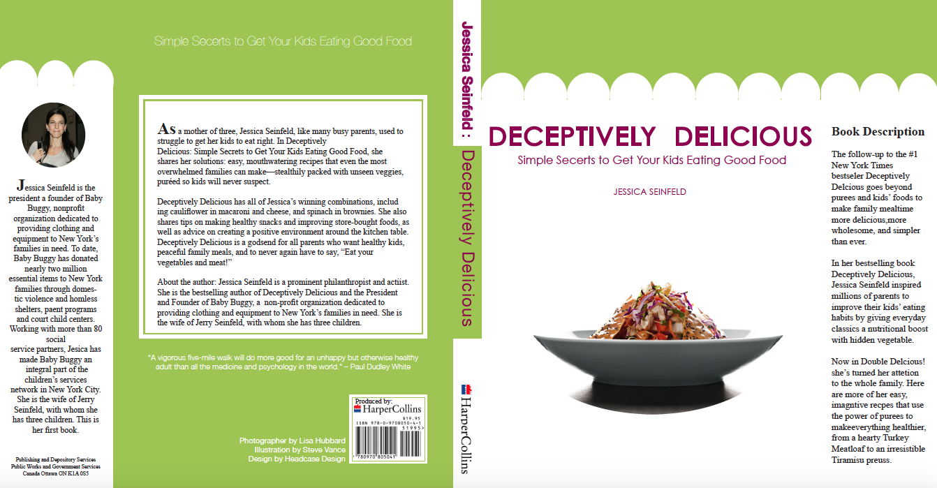
BOOK Deceptively Delicious
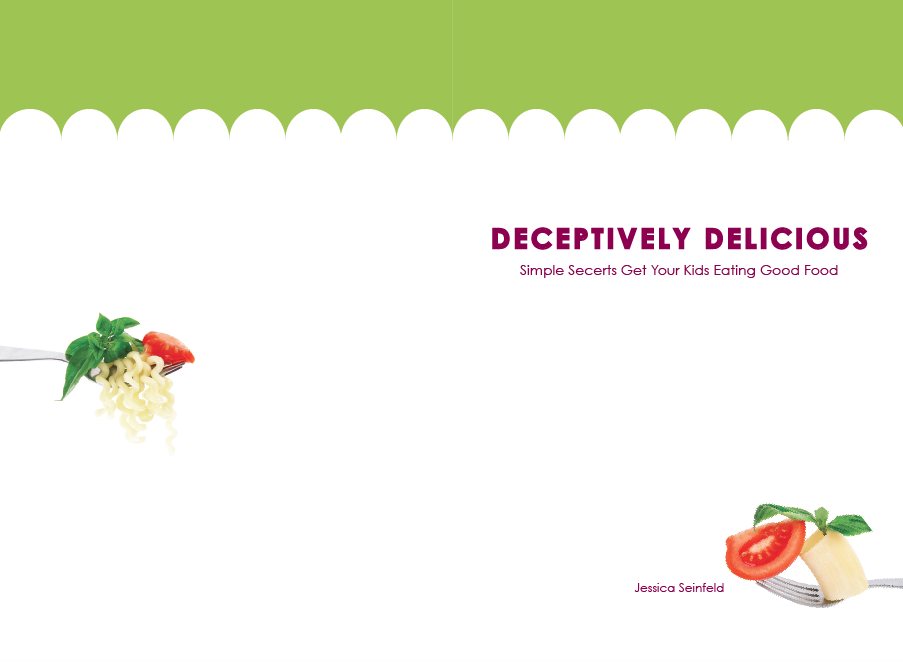
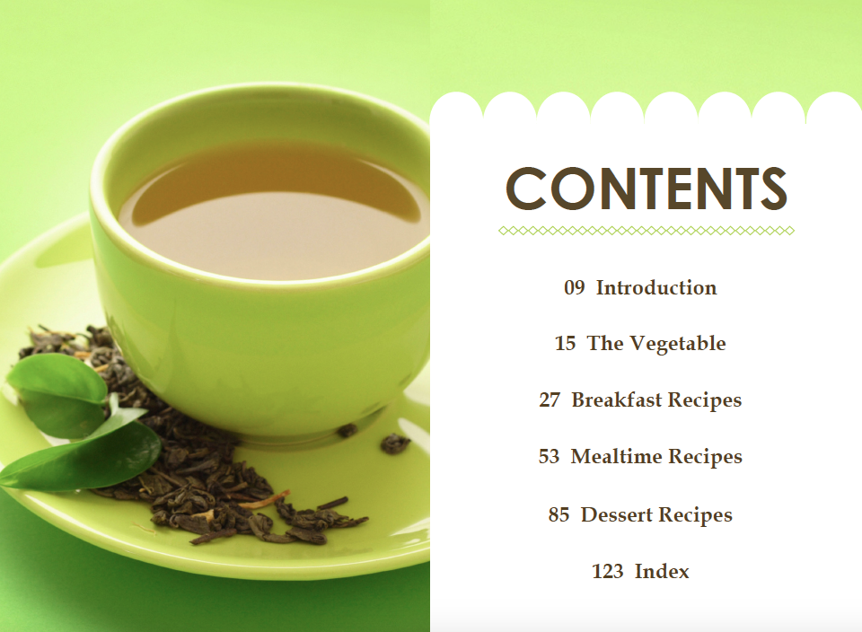
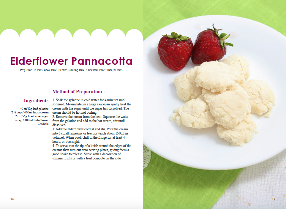
By the increasing obesity rates happen and rise to children’s growing, the book of Deceptively Delicious from the author Jessica Seinfeld, offers common knowledge to all the young parents and help them preparing healthy food for their kids. The original book from author Jessica Seinfeld simply represents that the target of book is for both parents and kids from the jacket of the book. In addition, the cookbook includes the spreads of simple recipes of the different meals and the briefly knowledge of nutrition preparation for meals. The layout and images is representative for the original book. By reading the cookbook, audiences can find out what healthy foods are, and why calcium, vitamins and omegas are good for their children health. In order to that, those parents develop their cook and become prominent nutritionist.
Additionally, this is also an interesting book in my everyday life. Even though the book Deceptively Delicious is very useful book for audiences to read, I still think that there weakness exist on the, Deceptively Delicious, original book design, such as target audiences, colors components, and the layouts of insides page. For redesigned Deceptively Delicious, the target audiences will be based on author Jessica Seinfeld original idea: this is cook and nutrition book for parents to prepare healthy food for their children. Parents are the core targets of this book. The healthy food will be such important elements for the book design. Besides, the redesign of the book Deceptively Delicious should avoid the childish look; the development of redesign book will show on the clear design elements and present the truthful value of the book. The simply and clearly jacket of the redesigned book can create interesting to audiences and get attentions from them on the first time. Once, the parents look for the cookbook at the stores or libraries, the book of Deceptively Delicious will be their first choose when they see the cover of the book. Hopefully, the redesigned book can attract more parents to buy the book and to help kids are getting the proper nutrition easier and growing up with healthy food.
-
POSTER Air Canada
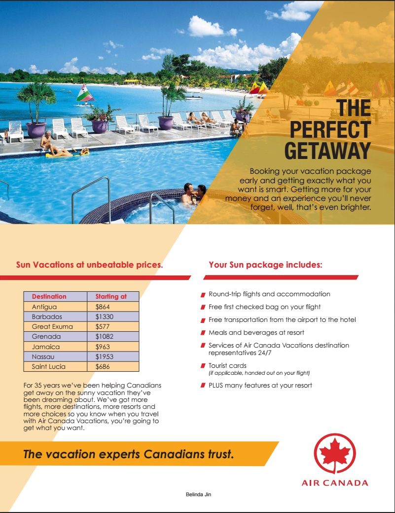
INTRODUCTION: The Air Canada ad feels clean and corporate, while exuding warmth that entices the reader to book their Air Canada Sun Vacation. A large photo that takes up almost half the page is used to draw the reader’s interest. A sunny orange color is used throughout the design to complement the blue water in the photo and let the reader know that this is an ad for tropical getaways. The Air Canada Pantone Red is used as an accent color to help break up important information. Tables and lists are used to further help organize the information in a way that is easy to read and does not require much effort from the reader. THE PERFECT GETAWAY Booking your vacation package early and getting exactly what you want is smart. Getting more for your money and an experience you’ll never forget, well, that’s even brighter. Sun Vacations at unbeatable prices. Destination Starting at Antigua $864 Barbados $1330 Great Exuma $577 Grenada $1082 Jamaica $963 Nassau $1953 Saint Lucia $686 For 35 years we’ve been helping Canadians get away on the sunny vacation they’ve been dreaming about. We’ve got more flights, more destinations, more resorts and more choices so you know when you travel with Air Canada Vacations, you’re going to get what you want. Your Sun package includes: Round-trip flights and accommodation Free first checked bag on your flight Free transportation from the airport to the hotel Meals and beverages at resort Services of Air Canada Vacations destination representatives 24/7 Tourist cards (if applicable, handed out on your flight) PLUS many features at your resort The vacation experts Canadians trust. -

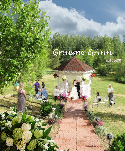
POSTER Graeme & Ann Wedding
-

COMPANY DESIGN Heart On Your Sleeve
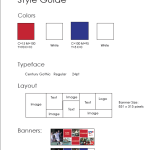
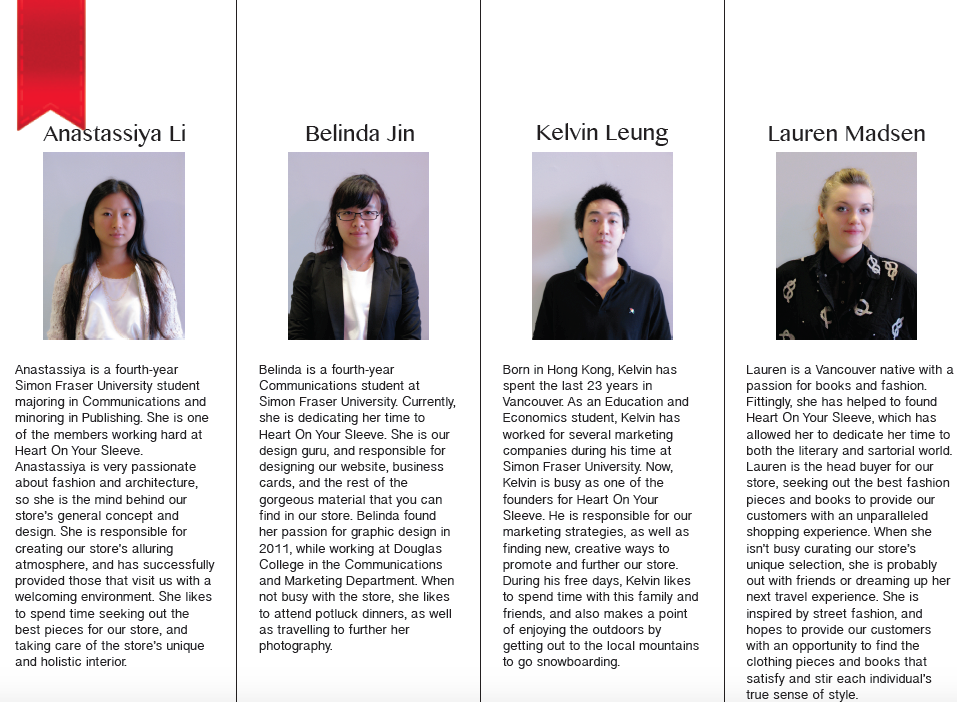
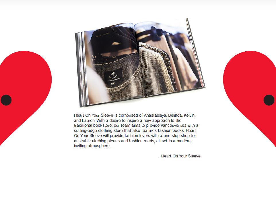
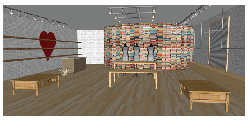
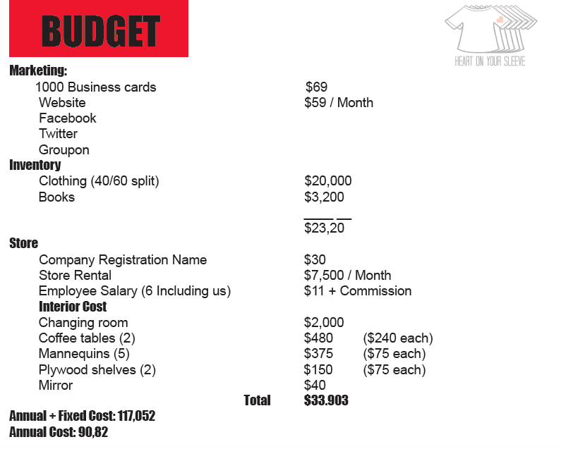
The name of our store Heart On Your Sleeve is comprised by me and my other three team members: Anastassiya, Kelvin, and Lauren. With the desire to inspire a new approach to the traditional bookstore, my team aims to provide, “Vancouverites with a supreme shopping experience. For those that love the art of fashion, Heart On Your Sleeve provides a distinct store environment: clothing and fashion related books are available for purchase. Beyond merchandises, Heart On Your Sleeve provides customers with a venue to immerse oneself in fashion, and enjoy an informative experience through our featured publications and highly knowledgeable staff. Our curated collection of products will include designers and books that are both local and from around the globe” (Heart On Your Sleeve Presentation Notes, 2013, p. 4).
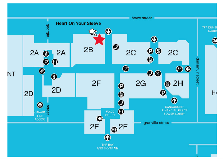
Based on this, Heart On Your Sleeve provides a unique shopping experience for consumers to choose the desirable clothing pieces and fashion reads. The main purpose of our store is clothing and book retailer, we will create an environment that is not only a shopping destination, but also provide the source of information related to the art of fashion. By this way, we located our store in Pacific Center Mall Downtown Vancouver since it’s the perfect location to setup our store to satisfy the need of both consumers and the fashion market (Heart On Your Sleeve Brief, 2013, p.1).
-

Creative Design
